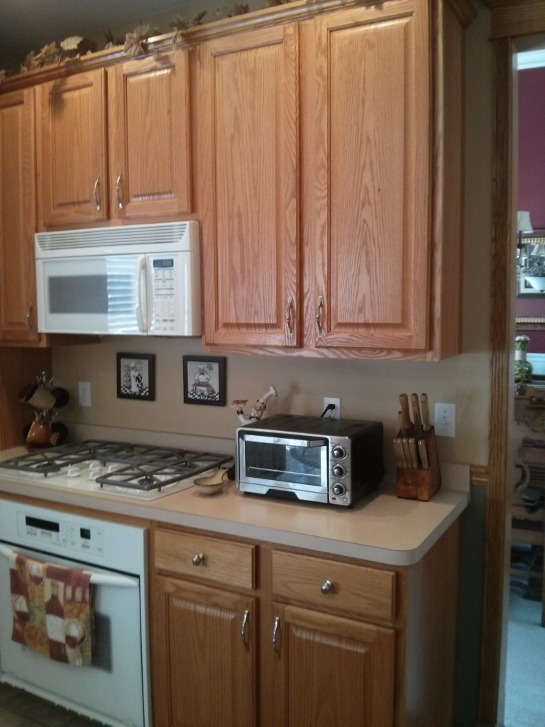
I’ve been remodeling and refacing kitchens for a long time. The good part about that is that you learn how to solve almost any situation that comes up during a kitchen remodeling project. The downside is that it becomes easy to keep doing the same thing over and over. This was a kitchen that I refaced, along with some custom work, in Mill Creek, Geneva. Here’s a “before” pic:
This probably looks pretty familiar, basic Honey-colored oak cabinets. Barb and Greg, the owners, had a few things they wanted to accomplish:
1. Get rid of the dated “oak grain” and use a richer, solid wood door
2. Put a more substantial crown molding on top
3. Convert some of the lower cabinets into drawers
4. Get rid of the desk area and replace it with a more useful space
5. If possible, move some cabinets to get more “elevation”, especially on the wall of cabinets with the microwave,
Items 1-4 are things I do everyday. No problem. Raising the microwave cabinet, however, can open up a can of worms. We’d have to replace it with a new cabinet, otherwise the microwave would be way too high. In addition, handling the crown molding on the cabinets on either side presents a bit of a problem.
I’d like to say that I came up with this idea, but really it was Greg, the owner – how about if we keep the cabinets the same height, but pull the microwave cabinet forward? Hmmm…there was no venting in the cabinet above and the microwave cabinet was a separate unit from the rest, why not?
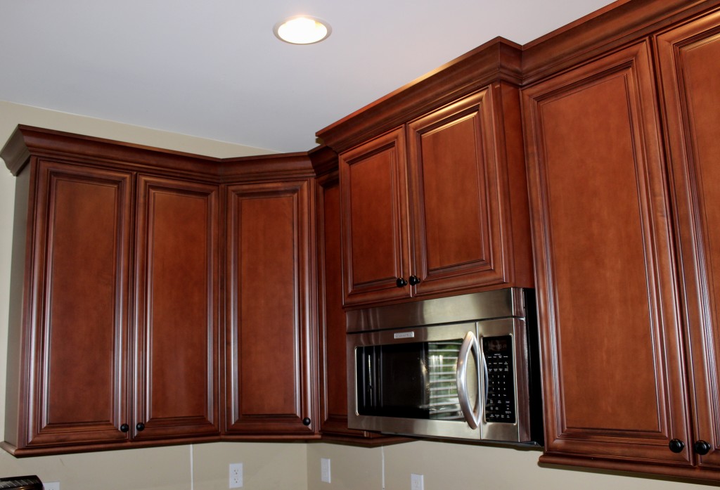
So we removed the microwave (which was getting replaced anyway) built a 3 1/2″ spacer block and pulled the microwave cabinet out from the rest of the cabinets. Now the crown molding will have an interesting little “jog” and the cabinet above will be flush with the front of the microwave face. Brilliant. In case you can’t picture what I’m describing, here’s a pic of the refaced cabinets after we pulled the microwave cabinet out 3 1/2 “:
I love the way it turned out. By the way, remember, these are the same cabinet boxes as before, just refaced in solid maple.
So that’s brilliant tip #1: Instead of moving a cabinet up for an elevation change, pull it out to accomplish a similar effect.
Brilliant Tip #2
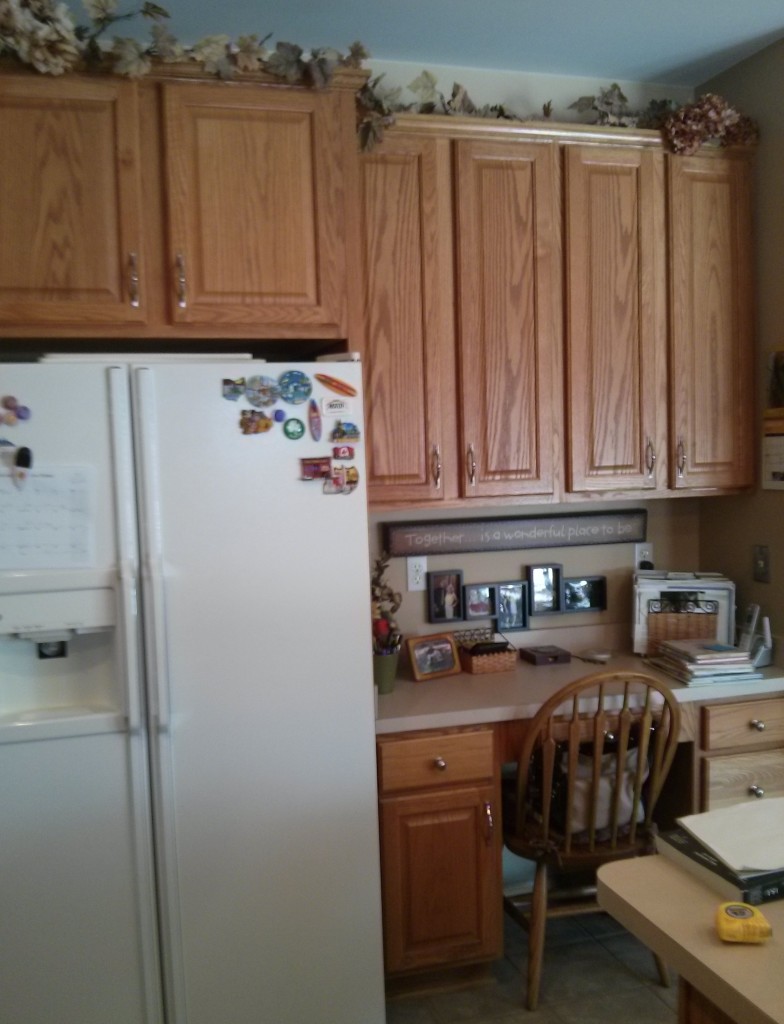
The standard depth refrigerator showed a lot of “side”, even with the wood side panel next to it. Barb and Greg wanted more of a built-in look. Here’s the “before”:
It’s a little difficult to see, but there is a wood “side panel” to the right of the refrigerator. What if we pulled the cabinet above the refrigerator out as far as we could, and widened the “side panel” next to the refrigerator? (I also took out and rebuilt the desk area, but that’s a story for another day).
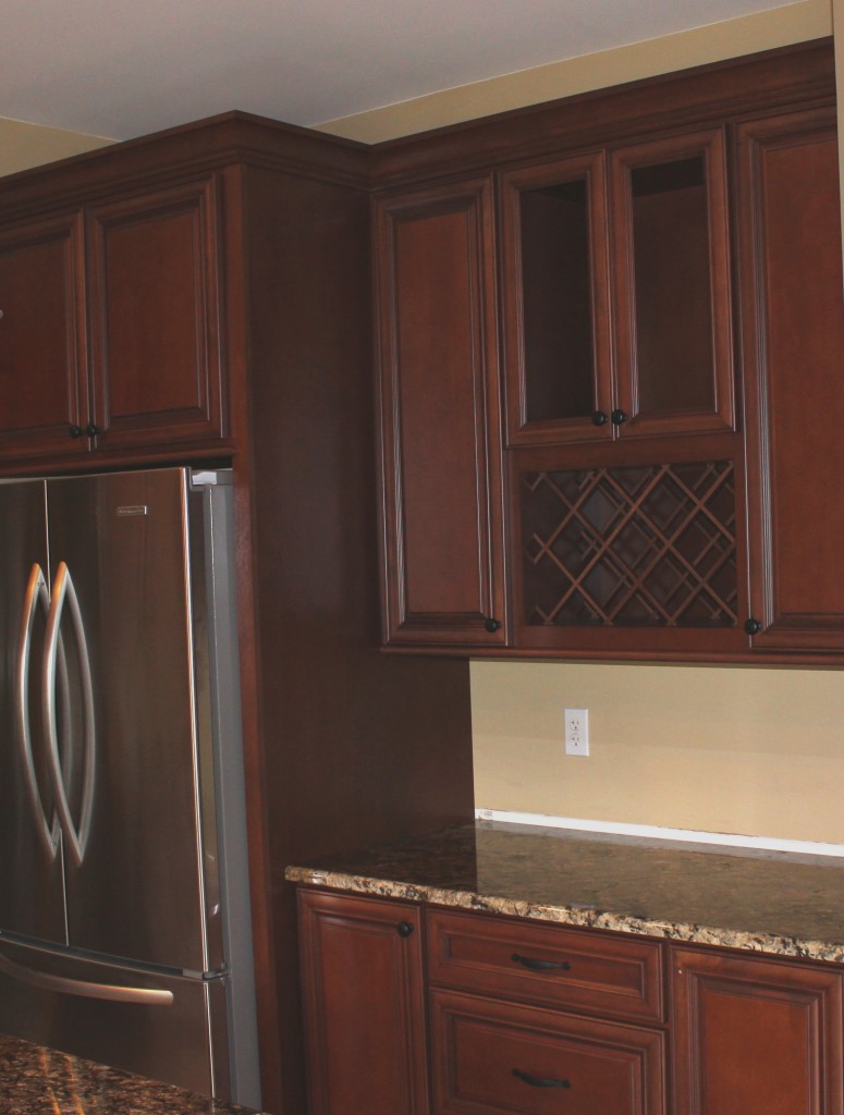
Here’s the end result:
That side panel used to stop at the counter edge, just by widening it another 3.5″ it makes the refrigerator look much more built-in.
So after all these years, I continue to learn new ways to bring people the look they want to their kitchens. Often times its a result of working with creative customers who have a ‘fresh eye’ when it comes to solving design challenges.


